For a very long time, black was the coolest smartphone color you could pick. It felt sleek and premium, almost like a more refined version of the neutral gray tones that Apple helped popularize. But now that it’s been done to death, black just no longer stands out the way it used to. That’s exactly why, when I was buying my latest phone, I went out of my way to avoid a black model.
Black phones used to look premium, now they’re just the default
What used to be the “cool” color is now just vanilla
There are many benefits to picking a black phone over another color—it’s professional, minimalist, blends in with the screen on the front, goes with any outfit or case, and is available on almost every smartphone model.
That last reason is exactly why black feels overdone. It’s predictable and boring, like vanilla ice cream or white sneakers, and because it’s everywhere, your phone blends in with everyone else’s. If you want a new phone you spent a thousand dollars on to feel special, picking the most common color is the quickest way to lose that feeling, especially if your previous phone was also black.
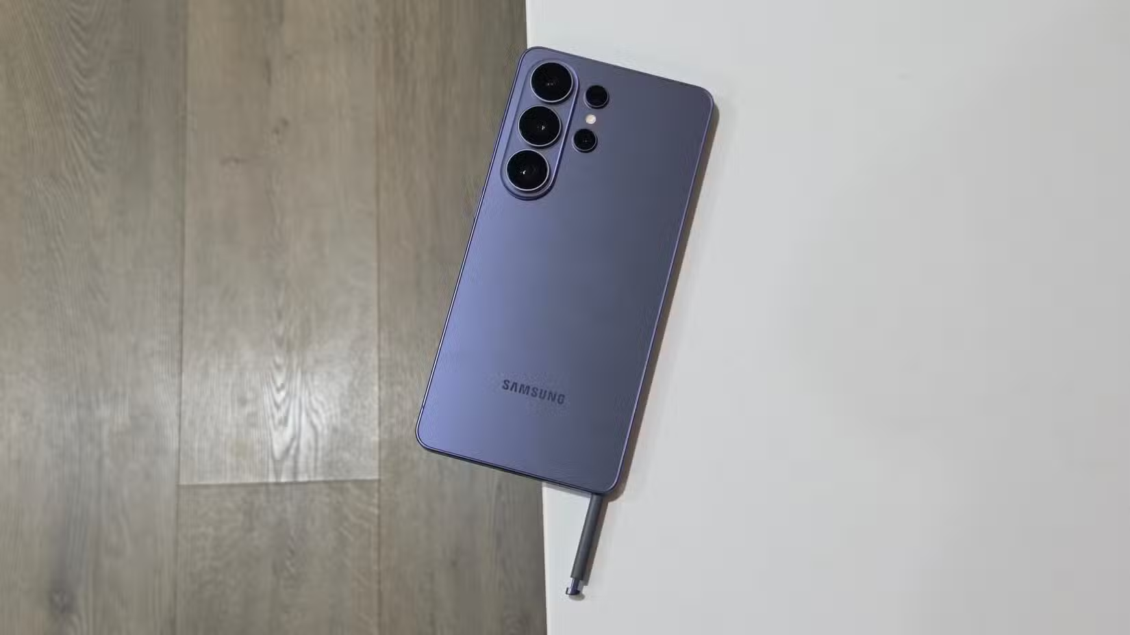
In fact, black isn’t the only overdone option. Everything I’ve said here also applies to other neutral dark colors. Dark blue hues have been popularized by Samsung and Apple, and while they look a bit more interesting than black, they ultimately fall into the same category of bland, dark, neutral tones.
Color is one of the few and most prominent ways to make a device feel distinct, and it matters for something that you hold in your hand and look at all day. Unfortunately, black doesn’t say anything about you and your personality—in fact, it signals that you like to play it safe.
Every dark phone looks the same, so I opted for something different
It’s safe, but it just isn’t fun
Now, you’re probably thinking that I’m one of those people who loves bright, vibrant-colored phones, but the truth is that I prefer muted tones: mint green, champagne, bronze, copper, baby blue, salmon, and lavender all look beautiful to me.
They’re not quite the attention grabbers that vibrant orange or yellow are, but they’re still a lot less bland than dark-colored phones that all look identical at a glance, with the camera layout being the only differentiating factor.
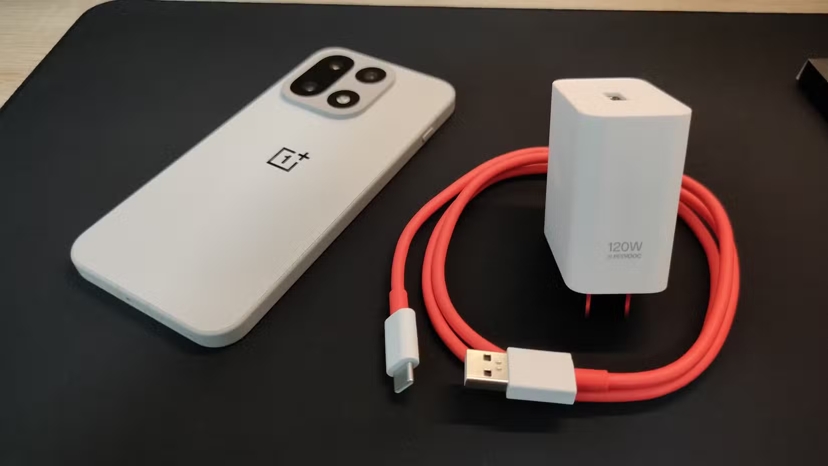
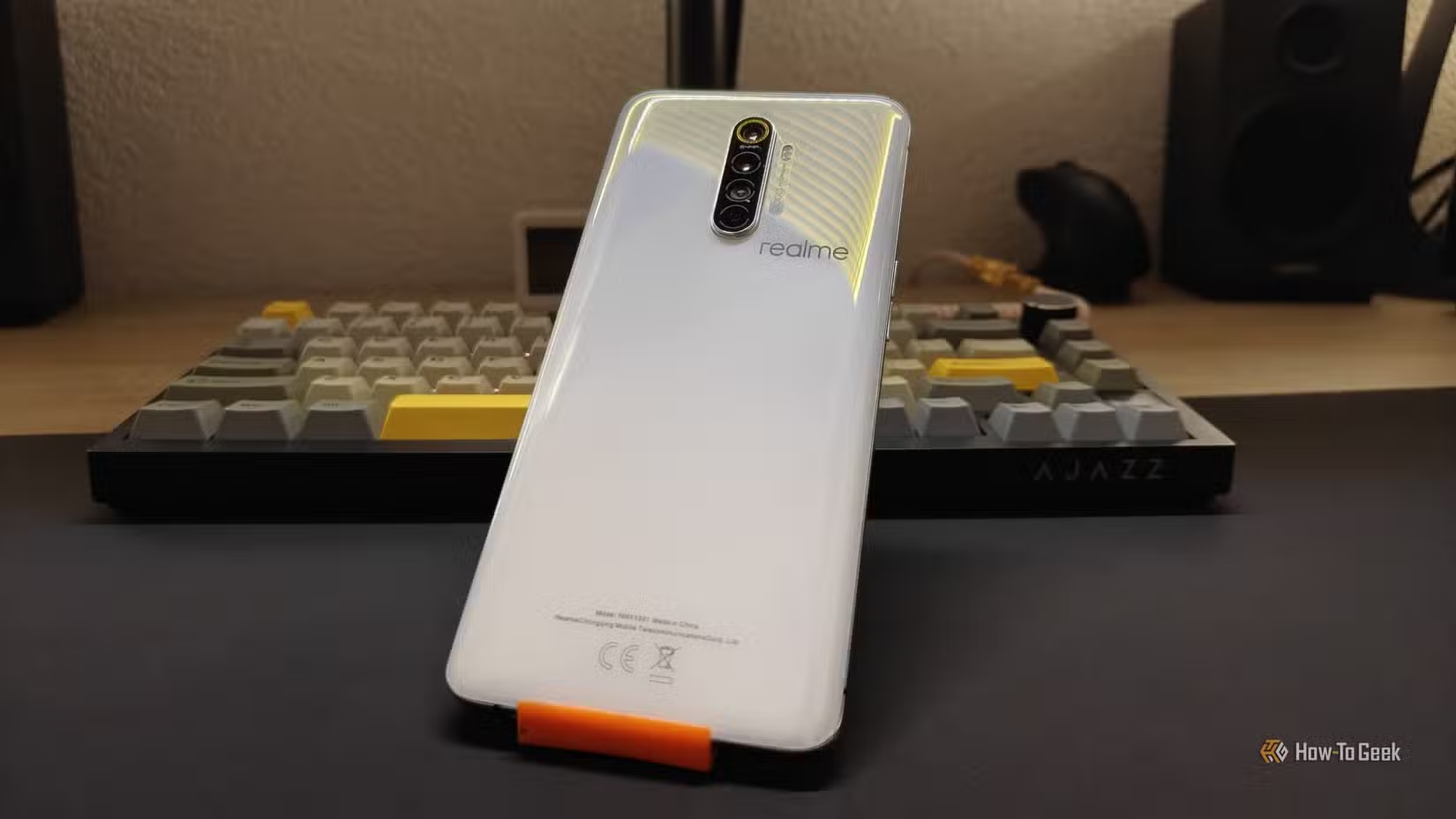
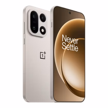
When it was time to buy a new phone this year, I opted for the Sand Storm OnePlus 15. Before that, I had a Lunar White Realme X2 Pro.
The Sand Storm OnePlus 15 is the only one with a non-glass back, and the new micro-arc oxidation coating on the sides and camera bump, but the real reason I picked it is that it just looks amazing. Ironically, the black option that used to make phones look premium is now the budget choice, as it’s the only available color on the 12GB RAM + 256GB ROM variant of the phone.
Sand Storm isn’t all that bold, but it still stands out in a sea of identical dark-colored phones—I never have trouble finding it when I leave it somewhere in the gym because it looks so unique. It’s actually very similar to the iPhone 16 Pro’s Desert Titanium, which I always thought was one of the best colors Apple has ever done.
9/10
- SoC
-
Qualcomm Snapdragon 8 Elite Gen 5
- Display
-
6.78-inch 2772*1272 (FHD+)
The OnePlus 15 features the latest Snapdragon 8 Elite Gen 5 SoC that enables gaming features never before seen on a smartphone. The 165Hz display is perfect for mobile gaming, and when not gaming, it runs at 120Hz, making it ideal for everyday usage. The triple camera array is pretty great, and the 7,300mAh battery lasts multiple days on a single charge.
Brands are finally making interesting colors again
But maybe you didn’t even notice
A while back, the only brands trying to draw attention to their devices with outlandish colors were budget-focused ones, like Motorola’s G family. Thankfully, those days are finally over, and bold colors are starting to re-emerge in the mainstream.
It’s impossible not to talk about phone colors without mentioning the iPhone 17 Pro’s Cosmic Orange, which is apparently more popular than the more neutral Deep Blue and Silver variants. Apple has made orange the flagship’s “primary” new color on purpose, and hopefully other brands will follow suit with at least one standout option in their lineups.
Unfortunately, Samsung hasn’t stepped up its color game in the new S26 lineup, but at least we’re getting a few unique options in the form of Sky Blue and Pink Gold.
Color is now the only thing that still makes a phone feel different
Smartphones all look the same, but color is a big part of the design
While I can’t force you to pick anything other than black for your next phone, I hope I’ve at least convinced you that dark shades are rather boring. The second you see a phone in a more interesting color that you like better, you’ll regret picking black, so think carefully before making this all-important decision. Or just slap a colorful case on it instead.
Source: Read Full Article